vicomm.de: A professional online presence
In my project for vicomm.de, a new B2B company specialising in educational videos, I was tasked with developing a website aimed at enhancing online representation and attracting new clients. The target audience ranged from startups to large corporations, requiring a versatile and professional online presence. I had a chance to call upon a number of my strengths, including client relationship management, technical proficiency, organisational skills, problem-solving and flexibility.
Responsive Design and Custom Features
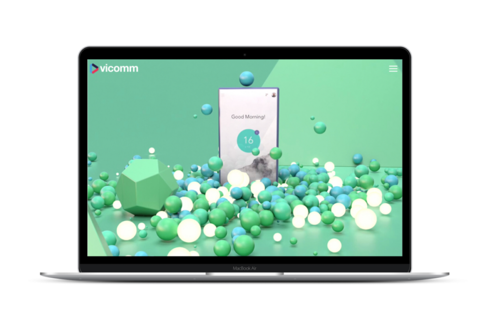
I developed the site using WordPress and Divi, ensuring it was fully responsive for both desktop and mobile devices. Key functionalities included a fullscreen video on the homepage and a hamburger menu for desktop navigation. A call to action was included on each page.
Client Consultation
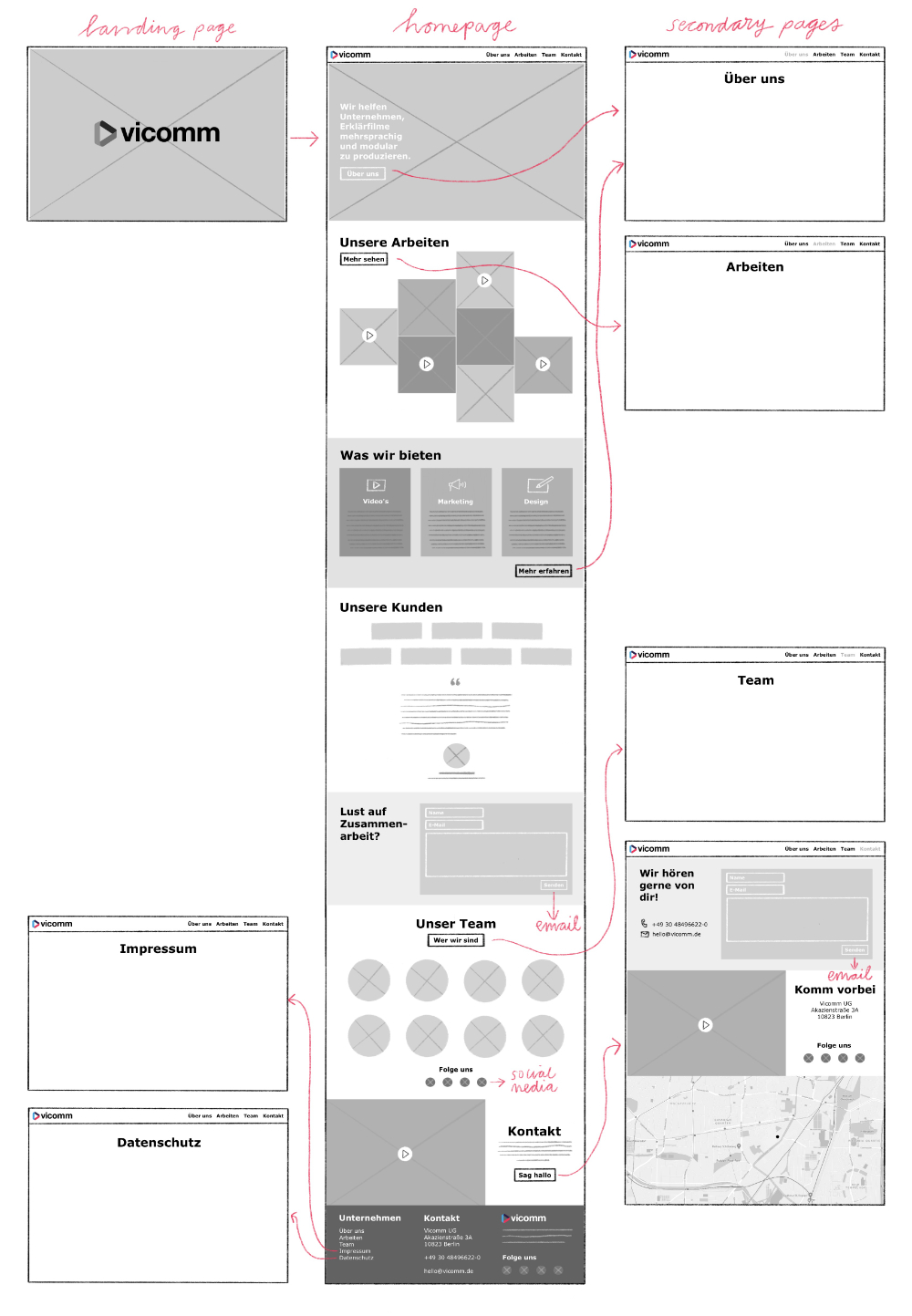
The project began with a thorough consultation with the client, who provided a rough sketch of the desired website structure and links to example sites. I translated these initial ideas into a clear, actionable plan by sketching a wireframe, ensuring alignment with the client’s vision and facilitating effective communication about the page structure and content requirements.
Concept Development
I proposed creating a scrollable home page with sections linking to dedicated secondary pages. This approach ensured a user-friendly navigation experience.
Corporate Branding Expansion
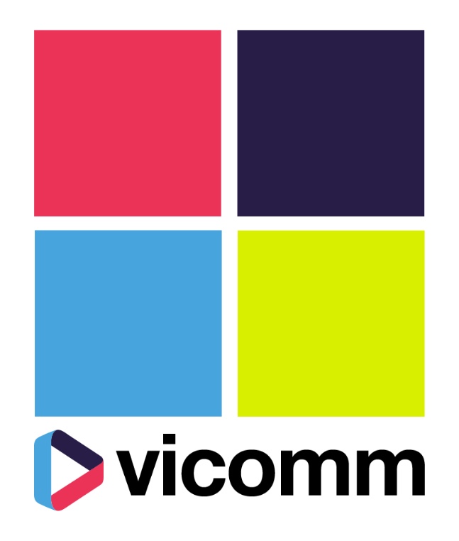
While the client had a basic logo, color scheme, and typeface, I expanded on these elements to create a cohesive and visually appealing brand identity. I created swatches for six proposed colours but recommended limiting the palette to four to maintain a clean design. I also developed prototype illustrations to represent the team.
Aesthetic Enhancements
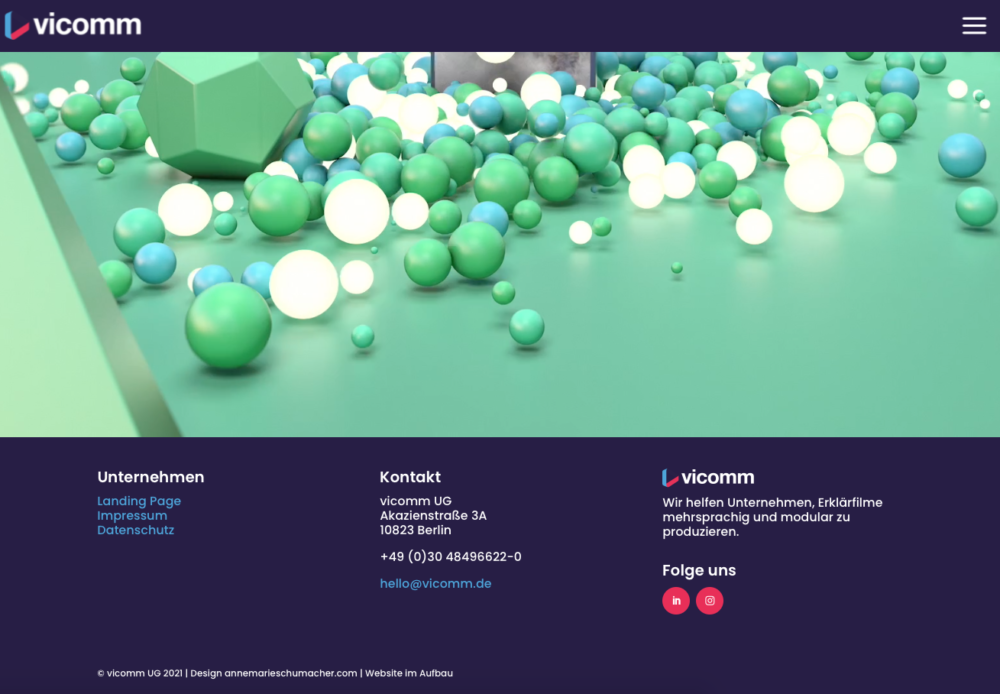
The homepage featured a fullscreen video on loop, with a minimalistic top bar incorporating a hamburger menu for a sleek, modern look, balancing aesthetics with functionality.
Website Navigation
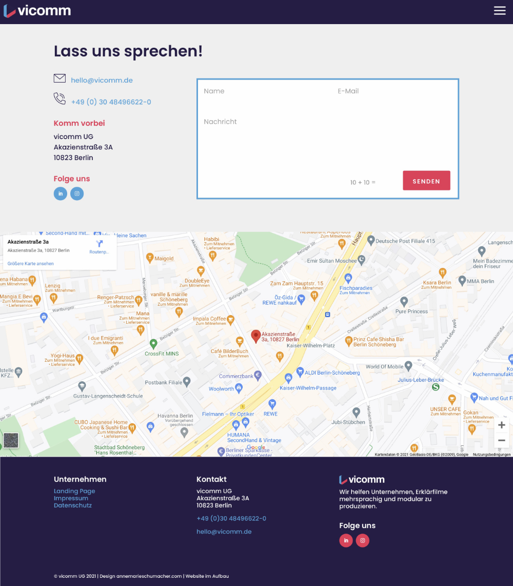
The footer menu included essential links, contact details, social media links, and the company’s logo and tagline, ensuring comprehensive and accessible site navigation.
Icon Design
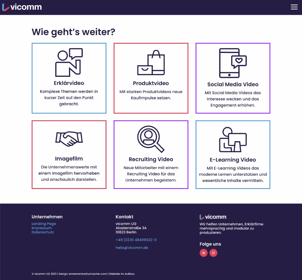
For the about page, I created six custom icons to illustrate different applications of educational videos. By converting specific headings into broader concepts (e.g., “Produkt” to selling, “Image” to values), I enhanced the clarity and effectiveness of the communication, distilling complex ideas into accessible visuals.
The contact page included a contact form as well as Google Maps integration.
Project Management
I maintained clear communication with the client throughout the project, ensuring timely delivery of content and design elements. Although the project was unfortunately halted before full development, the client was very satisfied with the completed landing page and the prototypes for other pages.

I'm an artist, designer and project manager, working from my studio in Berlin-Wedding.

